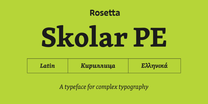
Primarily intended as a robust, energetic text typeface, Skolar was designed to address the needs of serious typography. The typeface, having seen extensive use across diverse platforms and purposes, continues to maintain its credibility in a variety of contexts while incorporating a subtle personal style. Architecturally, Skolar’s letterforms follow conventional proportions for comfortable reading, while its stylistic details introduce warmth and character.
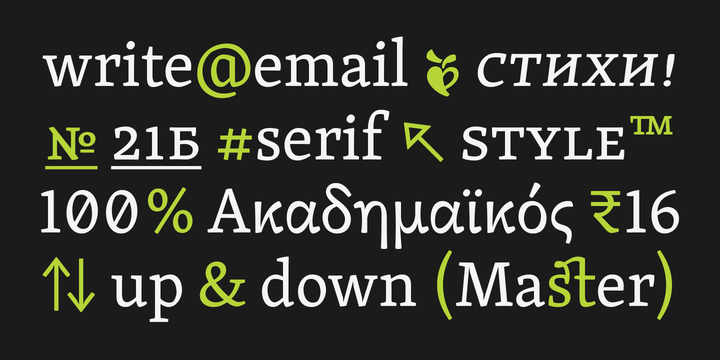
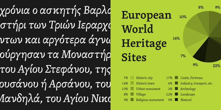
At the same time, features such as its relatively large x-height, robust serifs, and low contrast make Skolar a reliable choice even at small sizes and for the most complex editorial and academic text settings. Skolar’s vast character set caters for 90+ Latin-script languages, polytonic Greek, 44+ Cyrillic languages, various Latin transliterations (Pinyin, Sanskrit), Devanagari (Sanskrit, Hindi, Marathi, Nepali, …), and Gujarati.


