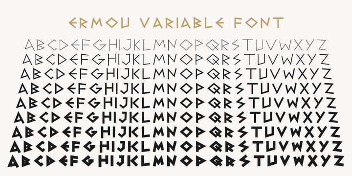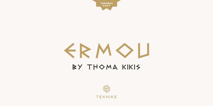
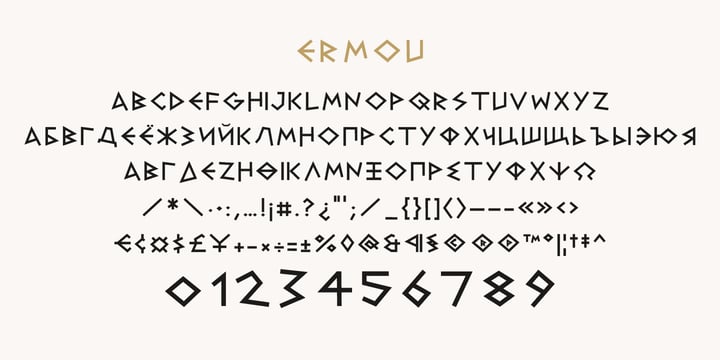
Ermou is a display monospace font. The typeface has a distinct geometry using sharp angled corners as a tribute to writing and carvings of Ancient Greece. The name is derived from Ermou Street (Οδός Ερμού) or “Street of Hermes” named after the Ancient Greek messenger God and "the bringer of good luck" Hermes (Ἑρμῆς). The famous street was one of the first roads designed in modern Athens, Greece. Today Ermou is Athens’ commercial heart and top ten most expensive retail streets in the world. Ermou is great for team sports, display work, invitations, writing, architecture, fashion, posters, titles and headings.
Saturday, April 10, 2021
Wednesday, May 13, 2020
Download Zuume Soft Fonts Family From Adam Ladd
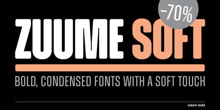
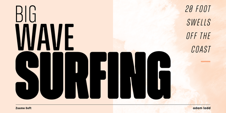
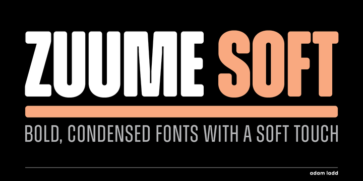
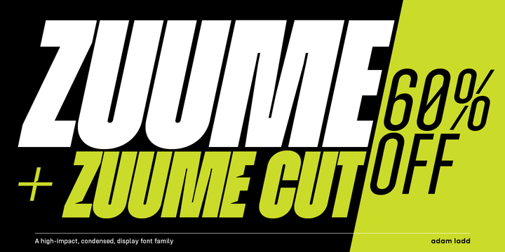
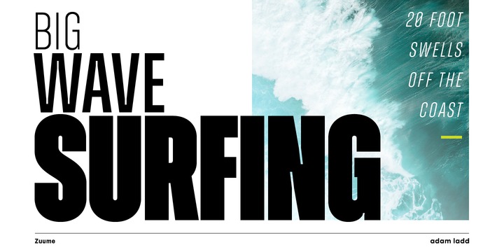
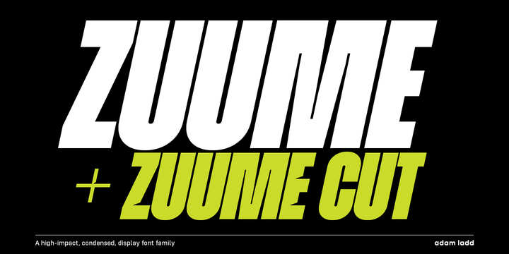
Zuume Soft is a high-impact, condensed sans serif, display font family with a soft touch. A sister to Zuume, this version features round corners for a little bit of a friendly appearance. Coming in multiple weights and italics, its range in thickness give a sharp, technical feel in the lighter weights, while the bold, blacker weights are meant to be tightly spaced and stacked for a visual punch.
A distinct characteristic of this all caps typeface is the notched and extended ink traps meant for both function and aesthetic interest. The strong and sturdy design makes it ideal for eye-catching headlines, branding, packaging, magazines, sports, logos, and more.
Also part of each font file are matching pre-designed catchwords that add texture to your typography. Stylistic alternates and arrow glyphs increase the options available as well.
Zuume Soft has many features:
• Catchword glyphs (PUA-encoded)
• Stylistic alternates
• Arrows
• Fractions, numerators, denominators
• Superscript, subscript
• Slashed zero
With about 600 glyphs, this font has extensive multilingual Latin language support (100+ languages) for Western, Central, and South Eastern European.
Monday, March 9, 2020
Download Poultry Sign Fonts Family From Ingrimayne Type
While searching through microfilm of an old, 1932 newspaper, I stumbled on the word "Poultry" written with trapezoidal letters. I did not recall seeing lettering like this and it inspired me to design a typeface that could produce a similar result.
Poultry Sign has six styles in two widths, each with three weights. It is monoline, monospaced, and all caps. The letters on the lower-case keys reverse the trapezoid of those on the upper-case keys. The designer's expectation is that the most common use for this typeface will alternate upper-case and lower-case keys. The spacing of the letters is identical within each width so the styles can be layered to produce bi-colored or tri-colored letters. There is a second set of numbers that can be accessed with an OpenType stylistic alternative. Also accessible with OpenType stylistic alternatives are variations of letters T, N, L, Y, and lower-case V.