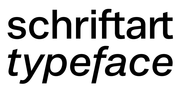
Noname™ (Pro) is intended to imply the appearance of a conventional typeface in a contemporary context. Due to the frequent use in the public service (among other things), the style associates a supposedly objective face.
The style is characterized by the proportions, the contradiction of the apparently perfect reduction and the retention of chirographic elements. In addition, the rapid further development of the input devices has meant that existing character sets have been added again and again, regardless of style and technical requirements.
With this work, the properties were analyzed, the characteristic features highlighted and summarized in a complete typesetting: Anonymity (procedure), bureaucracy (style by category), convention (shape) and formality (optical corrections).
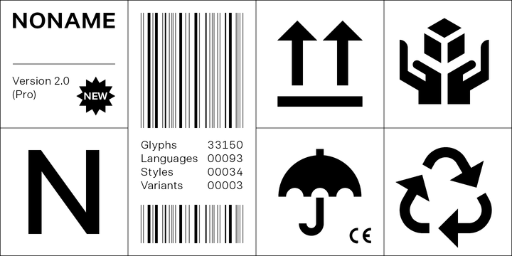
● 3 Variants: Human, Computer, Interaction
● 20 Stylistic-Sets
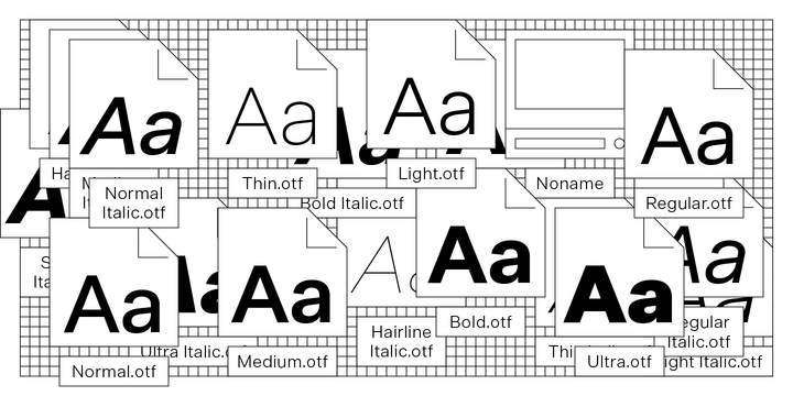
● 34 Styles
● 39 OpenType features
● 93 Languages Support
● 33,150 Glyphs (975/Style)
Designer: Bold Studio
Publisher: Bold Studio


